BFA in Design Practicum
As part of the Senior Practicum course, each student collaborates with a real-world client to develop a series of design solutions tailored to their client’s specific needs. The final assets are showcased in a two-week exhibition at the Carolla Art Exhibition Center in May 2025, highlighting each student’s creative process and application.
Client
Table Rock University
Year
May 2025


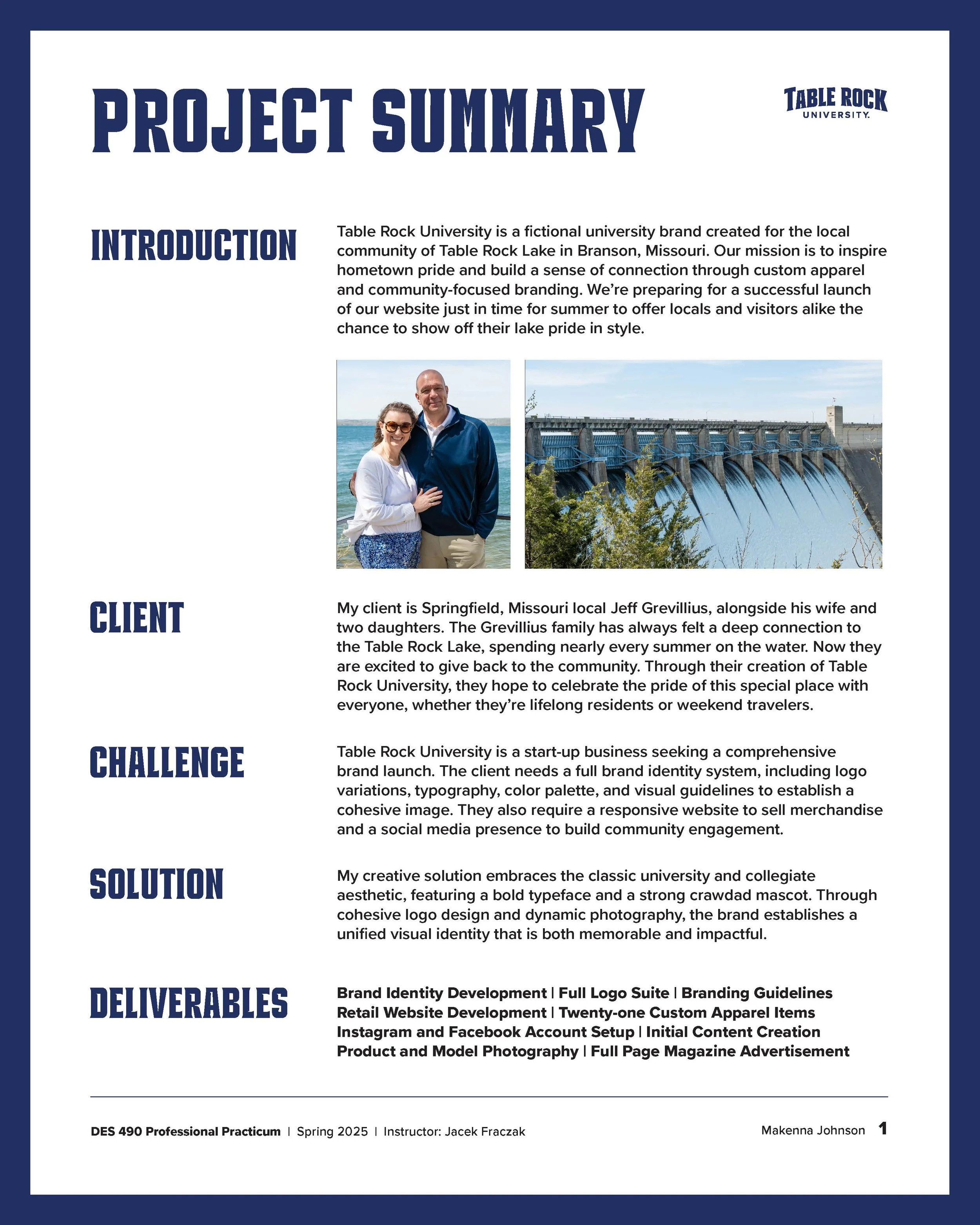
My client is Springfield, Missouri local Jeff Grevillius, alongside his wife and two daughters. The Grevillius family has always felt a deep connection to the Table Rock Lake, spending nearly every summer on the water. Now they are excited to give back to the community.
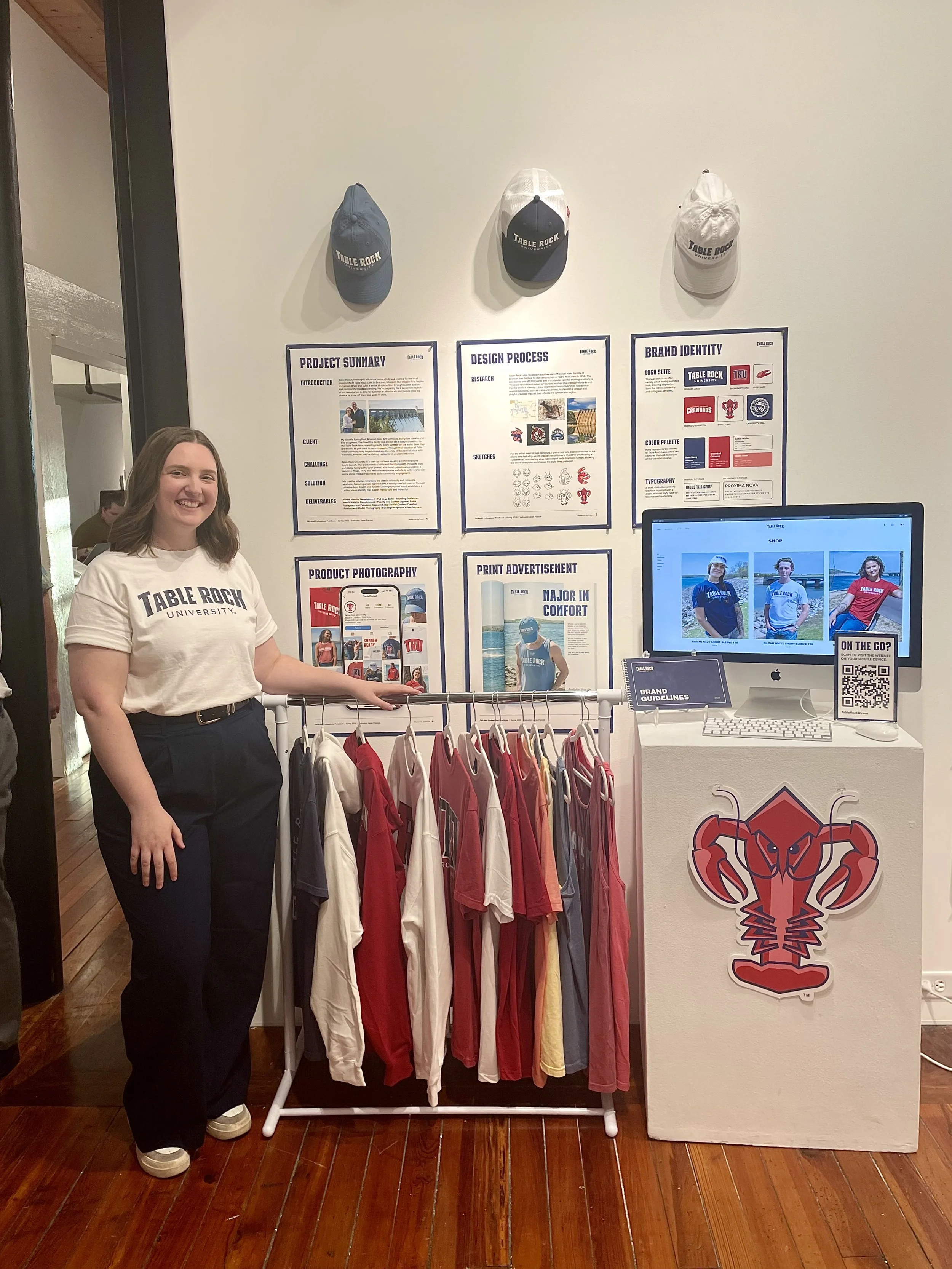
Table Rock University is a fictional university brand created for the local community of Table Rock Lake in Branson, Missouri. TRU plans to give back by starting a foundation to allow high school students in Stone County to apply for scholarships to further their academic education at a recognized four-year state institution or a two-year community college within the United States. Our mission is to inspire hometown pride and build a sense of connection through custom apparel and community-focused branding.

Table Rock University is a start-up business seeking a comprehensive brand launch. The client needs a full brand identity system, including logo variations, typography, color palette, and visual guidelines to establish a cohesive image. They also require a responsive website to sell merchandise and a social media presence to build community engagement.
My creative solution embraces the classic university and collegiate aesthetic, featuring a bold typeface and a strong crawdad mascot. Through cohesive logo design and dynamic photography, the brand establishes a unified visual identity that is both memorable and impactful.

Brand Identity Development | Full Logo Suite | Branding Guidelines | Retail Website Development
Twenty-one Custom Apparel Items | Product and Model Photography | Full Page Magazine Advertisement
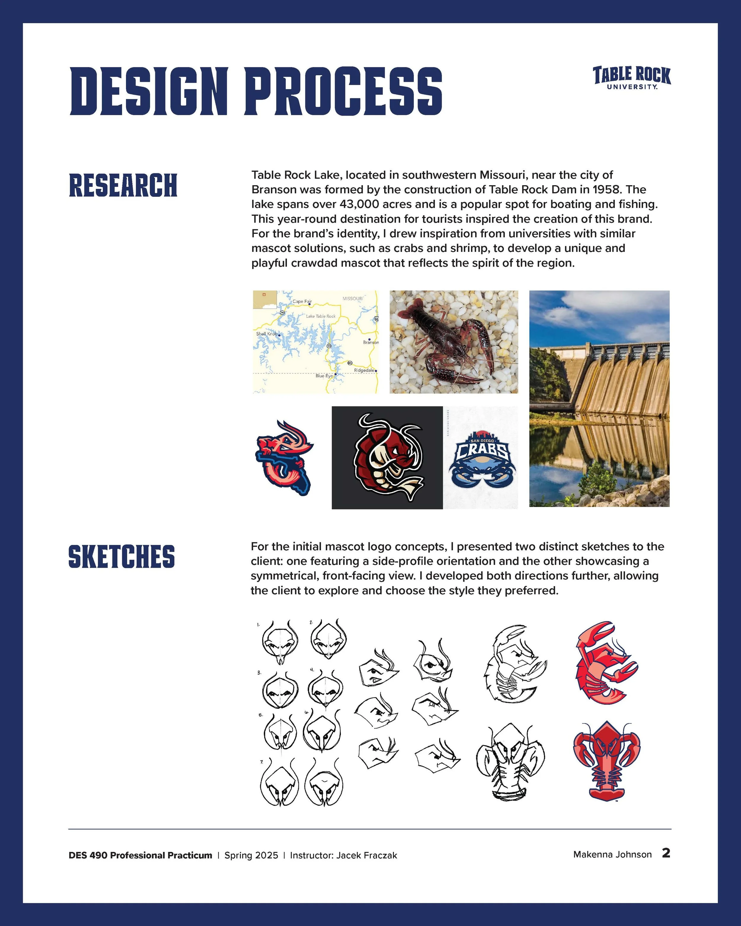


For the initial crawdad mascot logo concepts, I presented two distinct sketches to the client: one featuring a side-profile orientation and the other showcasing a symmetrical, front-facing view. I developed both directions further, allowing the client to explore and choose the style they preferred.

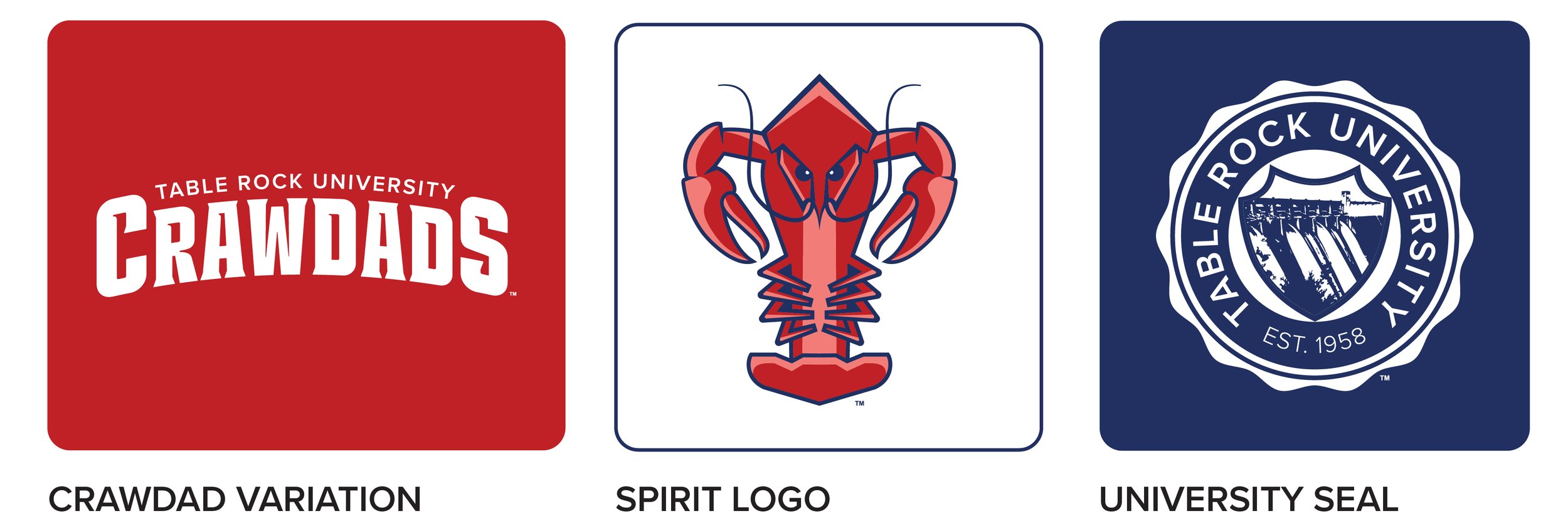

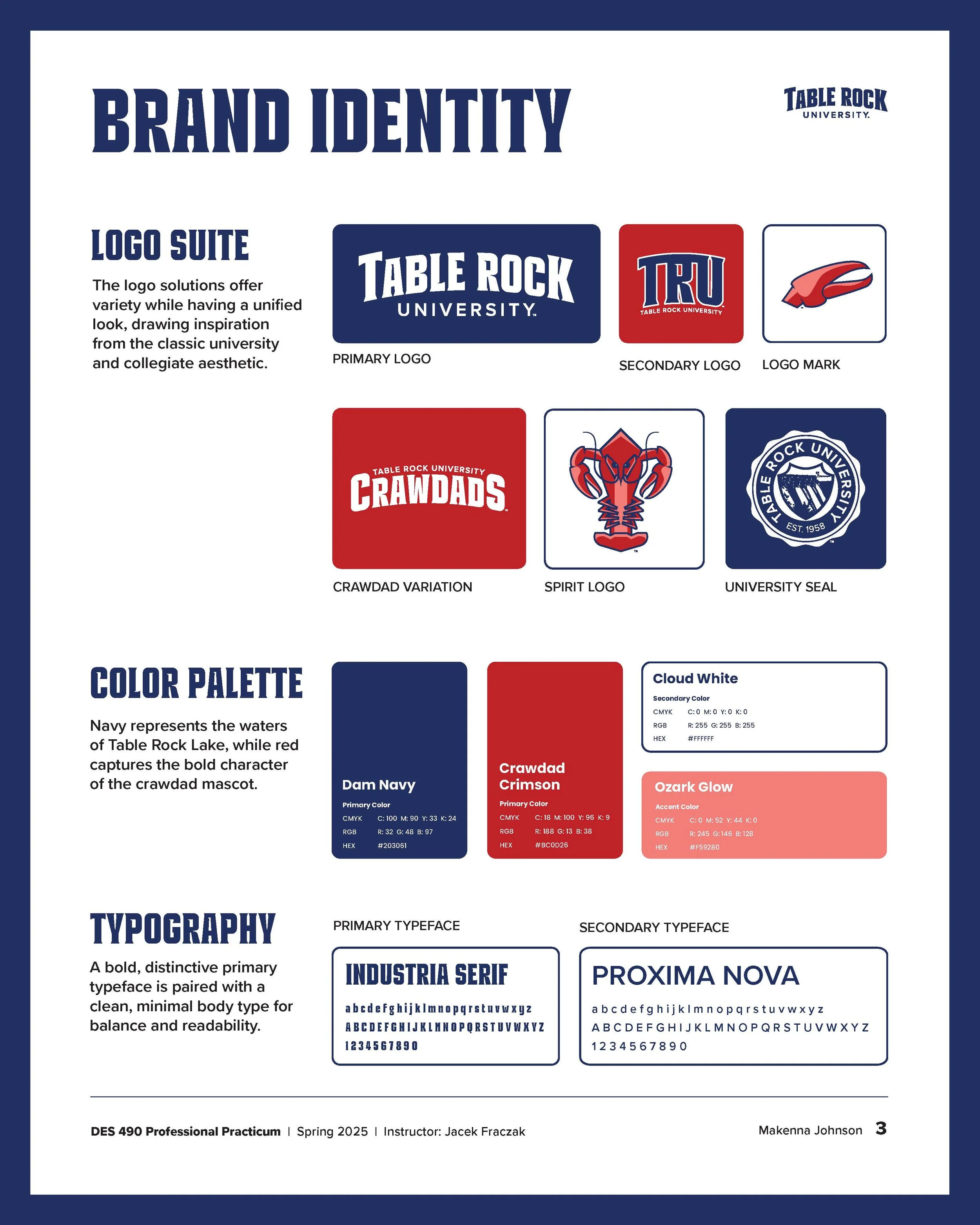
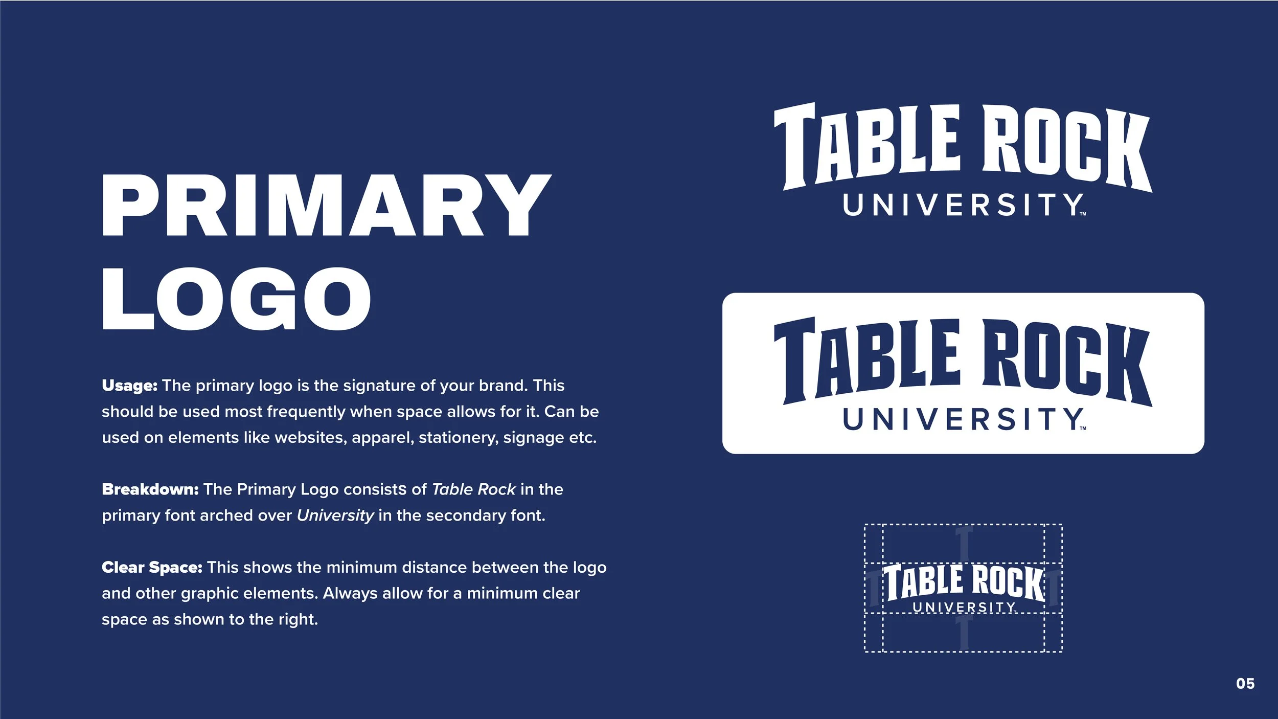
The logo solutions offer variety while having a unified look, drawing inspiration from the classic university and collegiate aesthetic.


Navy represents the waters of Table Rock Lake, while red captures the bold character of the crawdad mascot.


A bold, distinctive primary typeface is paired with a clean, minimal body type for balance and readability.


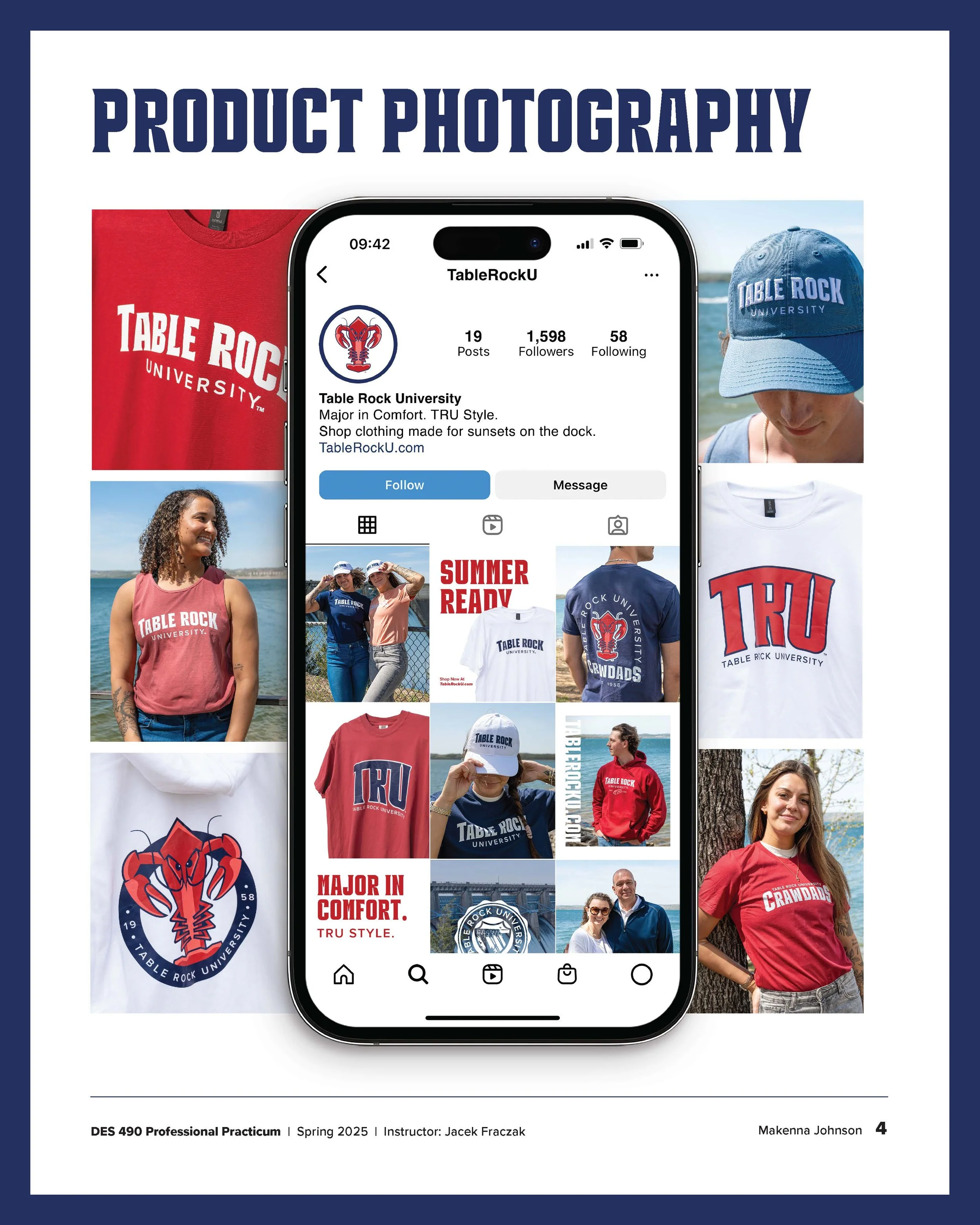
For the launch of Table Rock University, our goal was to build strong brand recognition through the first apparel collection. We selected a range of seven T-shirts, four tank tops, three sweatshirts, two pairs of shorts, and four hats. Each is available in a palette of colors that reflect and reinforce the brand identity. Every garment prominently features the “Table Rock University” typographic mark to maximize brand visibility. I photographed each item to showcase the collection across the website and social media for a cohesive look.


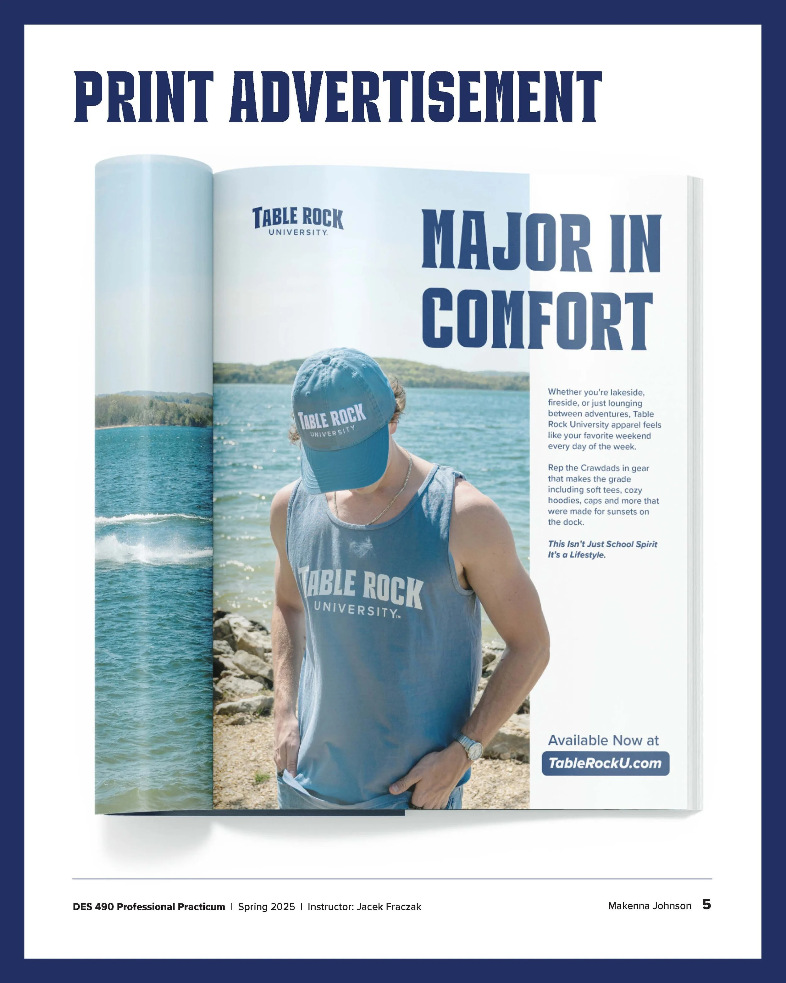
After finalizing production of our first apparel collection, we partnered with fellow students to bring the collection to life through a styled photoshoot at Table Rock Lake. Against the backdrop of the lake, I captured a variety of model shots to help customers better understand the fit and style of the selected item. These photos expand the mission of community-focused branding that celebrates the unique spirit of Table Rock Lake and the people who call it home.


This advertisement works to strengthen the brand's presence within the local community. It allows the brand to introduce its apparel collection and identity in spaces where the target audience is already engaged such as local magazines, community newsletters, visitor guides, and tourism brochures. The campaign tagline, “Major In Comfort,” is featured in the advertisement which is repeated across multiple platforms. This project also allowed me to combine my photography and design skills in one project.


The retail website is built with Squarespace. This was chosen for ease of transfer and adding additional content for my client in the future. It is important to me that when the project is handed off to the client, they are confident and are able to easily continue adding content that looks consistent as the brand develops further. This website features category tabs for ease of navigation and an about page for customers to learn more about the story behind the brand.
